Arthur Erickson intended his design of the Simon Fraser University campus to remain in harmony with Burnaby Mountain, using shallow stepped terraces and emphasizing horizontal planes that echo the landscape contours. To cross through the site is to experience stairs in all their aspirational associations and perspectival instabilities: we ascend and descend and ascend once more. At the top of the stairs we find stairs. Stopping to get our bearings in one of many lateral expanses we notice multiple staircases join and separate in studied horizontal geometries.
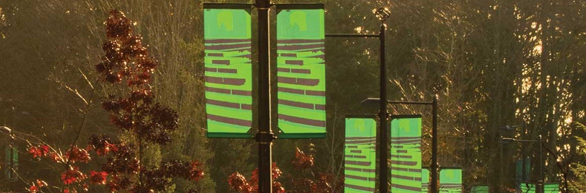
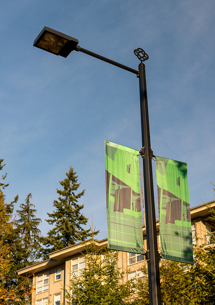
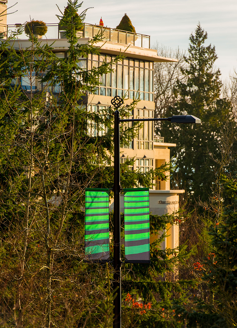
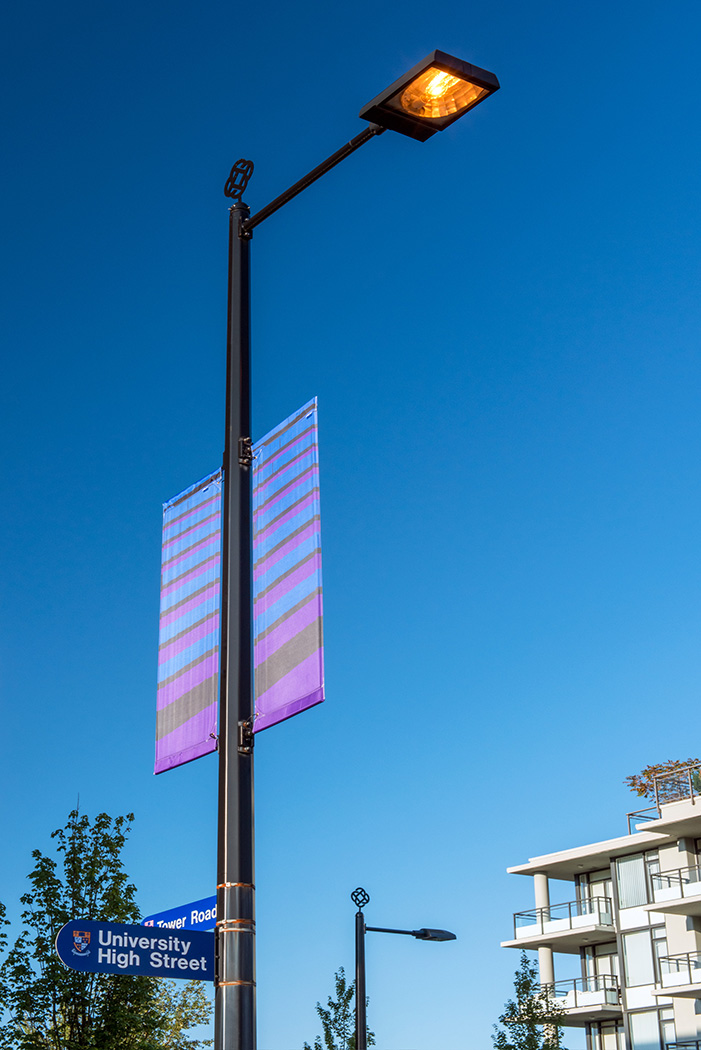
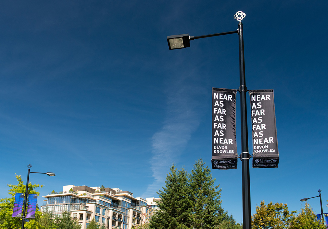
Devon Knowles has titled her new work Near As Far As Far As Near , echoing this formal symmetry in its very syntax. Her title lays out spatial relationships and reverses them, evoking a certain back and forth rhythm. In the series of banners devised for the 75 lamp standards along University High Street and selected intersecting roads, four images of the campus staircases repeat in sequences, sometimes paired, sometimes singular. The banner format crops the horizontal of Arthur Erickson’s orientation into narrow vertical slices. The nearest image is so near as to transform the steps and risers into solid alternating slabs of colour. Gradually, over the series, the viewpoints step back to include two staircases intersecting in a flattened perspective, then further, to reveal a recognizable archway, and finally far enough to show a number of columned entrances and a window. Within her radical crop of the picture plane, Knowles has simplified the tonal and textural information to allow for only the high contrast of light, shadow and middle tones to appear on the printed fabric.
Josef Albers’ 1963 text Interaction of Color records an experimental way of studying how our perception of any colour is altered according to the colours that surround it. Comparing visual perception to haptic (relating to touch) phenomena, one’s experience of colour can be altered through its context in the way that a sense of heat or cold relies on a felt memory of a median temperature. Drawing from Albers’ research, Knowles chose grey as the ‘control’ in her experiments with two seasonal palettes: one signifying summer, one winter. The winter grey appears as a brown tone, buoyed up and transformed in relation to the adjacent greens, while the summer grey, although it is identical to the winter grey, appears as a heavier charcoal tone, like wet concrete, when placed next to blue and purple. The seasonal banners will change twice a year and carry forward another reversal: the summer version will lighten the winter streetscape, and the winter version will anchor the glare of summer.
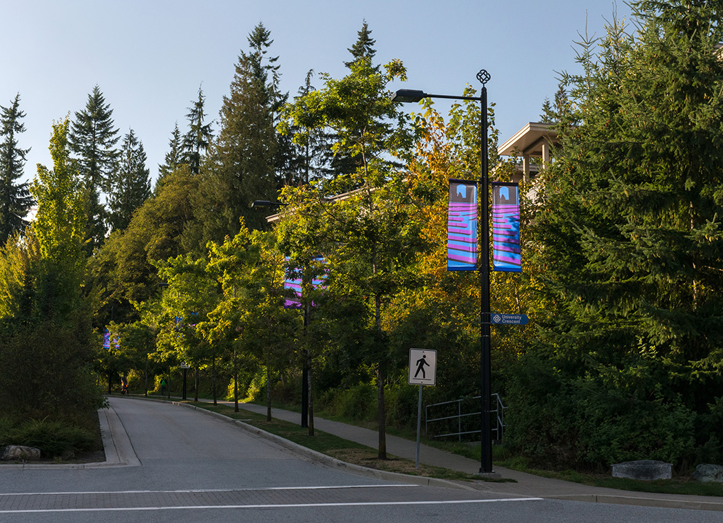
To determine the installation sequence of the banners, Knowles repeatedly walked the route from campus, along the level plane of University High Street shopping area, carried on down its slope, and back again. In a colour-coded, detailed document she mapped the varying steps between the lamp standards that are placed according to the length of the light cast by the taller, utilitarian streetlights and the lower lamps meant to illuminate the sidewalks. In a unique form of notation, she marked the longest distance between poles as the ‘highest note’ and the shortest distance the ‘lowest’. A greater number of steps between the lampposts are indexed to the ‘furthest’ image; the fewest steps connect to the ‘nearest’ image. This assignment jars any sequential narrative formed by what is pictured, and fractures the rational relationship between walking and arriving. Knowles’ composition subtly disrupts any visual harmonies to be found in the built environment and is attuned to the alternately quick and slackened pace of walking her route. As the work slopes down the hill, our sight lines tilt and the banners stack up in a processional show of pageantry.
Near As Far As Far As Near takes the familiar lamppost banner as a field of inquiry, and explores the potential to be found the standard vertical format, its repetition across the landscape and the ways in which colours carry meaning. The upright rectangles crop details of the mountaintop views, as they insist upon reiterating the tension between the horizontal and vertical, the mountain and the architecture, the climb and the descent. As multiples, the banners replicate the pace of bodies moving to and from their daily destinations across the ground plane. The images flatten and further abstract the ziggurat forms, playing with modern distances and ancient proximities in the concrete environment, transforming it into seasons with theories of colour.

Devon Knowles is a Canadian artist currently based in Vancouver, British Columbia. She received her Masters of Fine Arts from the University of Victoria in 2008 and her Bachelor of Studio Arts from the University of Guelph 2001.
In sculpture, drawing and site-specific projects, Knowles investigates the histories, economies and social meanings of diverse materials – from denim fabric and aluminum to coloured glass and mirrors. In moving such substances from their everyday context to a gallery environment, our appreciation of their properties and capacities becomes heightened. In working and reworking material, using traditional and contemporary fabrication methods or models of production, a rich language of the interplay of material and method emerges. As she engages with theories of perception, optical effects and tactility, alongside the direct act of making, Knowles encourages the viewer to access her work from a shared intimacy and sympathetic attentiveness.
Knowles has exhibited her work in solo exhibitions in Berlin, Toronto, Brooklyn and Vancouver. Group exhibitions include such venues as Vancouver Art Gallery; Night Gallery, Los Angeles, and Charles H. Scott Gallery, the Western Front, Or Gallery and Unit Pitt, Vancouver. Knowles has participated in the Mecklenburg Inspiriert Residency, in Kühlungsborn, Germany and the Solyst Residency, in Jyderup, Denmark and she has received grants from the Toronto Arts Council, the Ontario Arts Council, British Columbia Arts Council and the Canada Council for the Arts. She has taught at Emily Carr University of Art and Design, and her works have been included in numerous private collections.